|
|
|
Appraisal Score Summary Comparison Chart
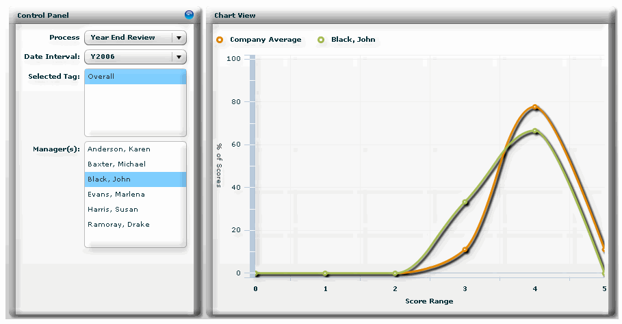
The Appraisal Score Summary Comparison Chart shows manager appraisal data compared to the company norm. The company norm is calculated by taking the Manager data set for the Process and Date Interval, rounding each employee rating for the selected Tag to the nearest integer and calculating a count by integer. The % or Scores (y axis) is calculated as: ((integer count) / (integer count total) * 100). The Score Range (x axis) is the set of integers. Administrators typically use the Appraisal Score Summary Comparison Chart.
Administrators can access the Appraisal Score Summary Comparison Chart on the Admin Reports page. On this page, an administrator selects a process, date interval and tag. One or more managers can be selected.
|
© 2023 Rival. All rights reserved. |

 |