|
|
|
Element properties
This is a summarized list of properties available with each element.
Elements |
Field Name |
Help |
Required |
Default |
Date |
Validation |
Encrypt |
|---|---|---|---|---|---|---|---|
Electronic Signature |
Yes |
|
1 |
|
Yes |
|
|
Acknowledgment |
Yes |
Yes |
1 |
|
|
|
|
Full Name |
Yes |
Yes |
Yes |
Yes |
|
|
Yes |
Text Input |
Yes |
Yes |
Yes |
Yes |
|
Yes |
Yes |
Date Field |
Yes |
Yes |
Yes |
Yes |
Yes |
Yes |
Yes |
Selection |
Yes |
Yes |
Yes |
Yes |
|
|
Yes |
Address Block - US |
Yes |
Yes |
Yes |
Yes |
|
2 |
Yes |
Address Block - CA |
Yes |
Yes |
Yes |
Yes |
|
2 |
Yes |
1 When included on an eForm both the Electronic Signature and Acknowledgment are automatically required.
2 The Address Block fields include Zip or Postal Code validation as appropriate.
Field Name: All fields must have a field name value. The initial value is based on element type and a number. Field names must be unique within the eForm. The field name is used to identify the field and when the eForm data is collected using the API.
Note: Changing field name value impacts any integration that has been built so be cautious. You must click the lock icon ( ) to change the field name. This extra step prevents you from accidentally changing the field name.
Help Text: You can include help text on fields where input is requested from the employee. A question mark icon ( ) appears next to the input field:

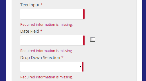
Required: When designing an eForm, you can indicate required fields by selecting this check box. A required field is indicated in three ways to the employee filling out the eForm:
- Red asterisk at the end of the prompt.
- Red bar on the right of the input field.
- An error message below the field.
Default: When an eForm is opened, default values can be filled in from the benefiter’s profile. The fields listed in this drop-down are from the Employee Profile.
Date Format: How dates are displayed can be set when designing an eForm. The options are:
- MM/dd/yyyy – two-digit month / two-digit day / four-digit year: 07/20/2015
- dd/MM/yyyy – two-digit day / two-digit month / four-digit year: 20/07/2015
- Localized Short Date – Will change the display of the short format based on the language of the browser viewing the form.
- US English example: 7/20/15
- French example: 20/7/15
- Localized Medium Date – Will change the display of the medium format based on the language of the browser viewing the form.
- US English example: Jul 20, 2015
- French example: juil. 20, 2015
- Localized Long Date – Will change the display of the long format based on the language of the browser viewing the form.
- US English example: July 20, 2015
- French example: juillet 20, 2015
Validation: A list of validations that can be selected for each field. The validation functions are different for text and date fields.
Encrypt: Encrypts the data when the eForm is saved. Encryption translates data into another form, or code, so that the data is protected.
| ©2022 SilkRoad Technology. All rights reserved. |
| Last modified on: 12/3/2020 7:19:27 PM |